On the Beach, Part Six - Even More Maui Rocks (Black and White); Maui 2017
; Maui 2017&layout=none&ref=https://bobeastaughimagery.zenfolio.com/blog/2017/11/on-the-beach-part-six---even-more-maui-rocks-black-and-white-maui-2017)
By now you've probably seen more than enough relatively little rocks in the recent posts. No matter how intricate the rocks are, or how firmly they sit on golden sand (until the next wave arrives), you might, understandably, be pretty bored. The rocks so far have been both interesting and also potentially boring, in the way a Joseph Cornell box assemblage of disparate found bits can be simultaneously both interesting and boring. The rocks, after all, are disparate bits found in nature. The modest size and substance of both the rocks and Cornell's bits diminishes their presence and importance.
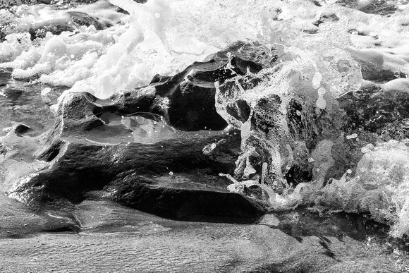
The images below depict a different kettle of rocks. They are black and white (or Black and White to some - although upper case implies pretentiousness) conversions. To me the conversions below have greater presence and are more interesting than their color originals. Maybe these conversions also have more "drama," but that may overstate the effect, and not all these images are inherently dramatic, anyway. Is a stationary rock that is in no great danger of being dislodged nonetheless dramatic (Image 2)? If a wave splashes over a rock, does the black and white image really convey more drama (Image 5)? Finally, two pre-conversion color images are included for comparison with their conversions.
What is it about black and white that causes us to keep circling back to it? Henri Cartier-Bresson expressed various explanations for his nearly exclusive use of black and white film. The explanation most compelling to modern ears (now that color imagery has long resolved its technical limitations when Cartier-Bresson was most active) was his view that black and white best captures a subject's abstraction, implying that this abstraction is in some way more important or more revealing. Actually, what he said in 1974 was this: "I find emotion in black-and-white: it transposes, it is an abstraction, it is not 'normal.'" (Henri Cartier-Bresson, Interviews and Conversations, 1951-1998, Aperture, at 66) That view is broadly persuasive to me. The resulting abstraction strengthens the image by simplifying it, distilling it, and emphasizing its graphic elements.
But some interesting wrinkles underlie Cartier-Bresson's value judgment. His explanation recognizes at least implicitly that the "real world" is in color and that we - including photographers and HCB himself - see it in color, but are nonetheless making a conscious choice (either by using black and white film or by digitally converting the image files) to record it without color. We are thus consciously rejecting the "normal" world and abstracting it. Is that good or bad? From a purely esthetic standpoint, there is no good or bad. Everything in this regard is in the eye of the beholder (the person who either beholds the scene or the final image).
Apart from esthetics, does the choice cause potentially troubling distortions of reality? The abstraction simplifies the image by discarding information (the color data). Is this any different than what a painter does? Or it is conceptually different because, unlike painting and despite Photoshop, photography is still regarded as reflecting or recording reality? Maybe that topic can be discussed fruitfully sometime farther down the road.

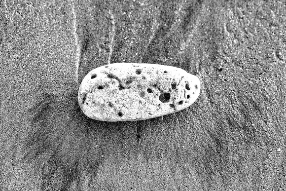
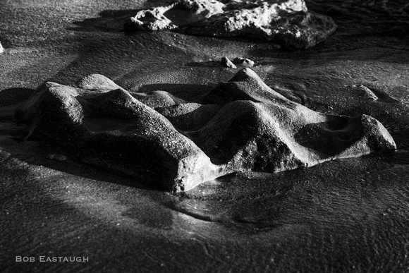
This rock seems stationary for the moment, but its angled stance implies impending movement (even if you didn't know waves are breaking nearby).
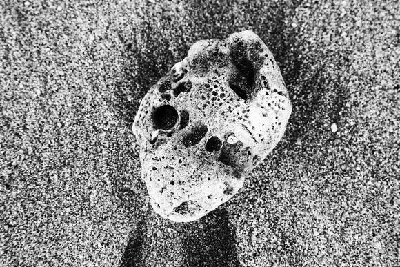
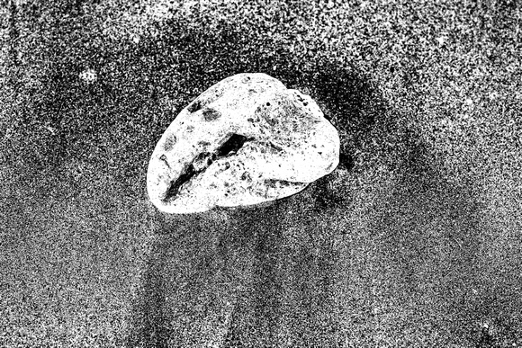
The design on the porous surface seems analogous to indigenous Alaska art. The rock implies stability, order, and survival following tribulation.

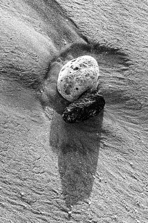
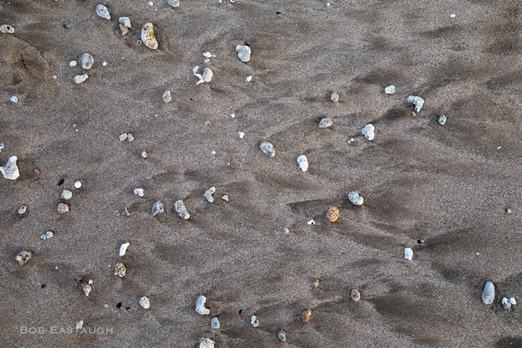
Whether macro- or micro-, the shapes are abstracted. The rocks on the right, themselves naturally black and white, were proximally situated by nature. The photographer did not move them (or any others). Can a picture of rocks be a photographic statement without being a political or sociological statement? Sure. It's up to the beholder.
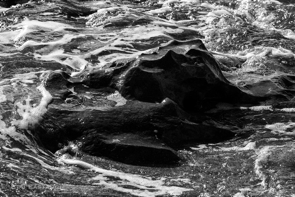
Larger formations have their own visual - even anatomical - presence, and enough physical density to disrupt and divert waves.
Finally, here are two color-conversion comparisons. The color versions are interesting, given the particularly intriguing shape of the rock in the first pair and the quasi-astronomical array in the second pair. Here the conversions are somewhat more interesting than the originals, but that interest might be the product of the high-contrast conversions. Conversions with a full array of mid-tones might have been less interesting. Indeed, when I edited the conversions, the choices retaining those mid-tones seemed less interesting and certainly less dynamic.


Comments
After a lifetime of mainly expressing myself with words, my postings here will mainly rely on images. They will speak for themselves to some extent, but I'll usually add a few comments of explanation. I've taken photographs for decades, since the 1950's, inspired in part by my father's photographic skill. Four years of photo assignments and quality darkroom time eventually gave way to decades of casual and family picture-taking. I re-immersed myself when I left film and turned to digital.