True Colors (Four)
&layout=none&ref=https://bobeastaughimagery.zenfolio.com/blog/2017/6/true-colors-four)
After the ungulate interlude, we return to color. We first have to set aside any preconceptions that B&W is the only true, pure means to photograph and that color is either impure photographically, or so difficult to use properly that color images are necessarily flawed, or so easy to use that no skill is involved. Human eyes see color, so there is no inherent physiological reason why we should invariably avoid color in photographs. I suppose we could avoid color if we were only showing the images to dogs, which supposedly don't differentiate colors. In any event, it is odd to think B&W is purer, considering that digital camera sensors record in RGB, and that modern "pure" B&W requires a pretty heavy-handed computer conversion long after the scene is photographed. Modern cameras can be set to display only B&W, but the images files can be readily returned to display the RGB data actually recorded.
Apart from notions of purity are notions of quality. Perhaps, because a higher percentage of fine photographers probably chooses to work in B&W than does the picture-taking public-at-large, the percentage of B&W images that is good is higher than the percentage of color images that is good. But that doesn't mean there is no good color photography, or even that there are more good B&W images than good color images. Color is not inherently inconsistent with quality.
Color does necessarily implicate taste and preference, of both the photographer and the viewer. Taste and preference are highly personal values, and subject to change. Examples are easy to find in painting. The Salon wouldn't initially hang Monet; no one bought Van Goghs while he lived (okay, he sold one); Picasso was always ahead of broad public acceptance. Many viewers ridiculed Pollack at first.
Where are we going with this? Just here: Color is "simply" another (although important) image tool, but it has the ability to depict what the eye actually sees and also to amplify what the eye sees, exaggerating for effect or emphasis.
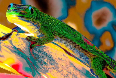

Exaggeration for effect.
These next two also exaggerate color for effect:


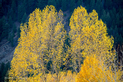
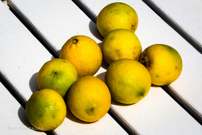
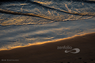
And these next six all were produced with some color exaggeration for impact:


The conclusion: Color can work in service of quality photographs.
Comments
After a lifetime of mainly expressing myself with words, my postings here will mainly rely on images. They will speak for themselves to some extent, but I'll usually add a few comments of explanation. I've taken photographs for decades, since the 1950's, inspired in part by my father's photographic skill. Four years of photo assignments and quality darkroom time eventually gave way to decades of casual and family picture-taking. I re-immersed myself when I left film and turned to digital.