Intersections: Ski Racing and Photography; More Thoughts, Part 8
Making choices is an unavoidable part of life. It is also an unavoidable part of the ski racing (which races to enter, which skis to wear, which wax to apply) and photography (which bodies and lenses to take, which settings to make). And the intersection of racing and photography is ultimately about selecting among competing images.
Sometimes -- rarely -- there are few choices, as when the subject is predetermined (you need a left-footed a picture of Racer X against a red GS panel) or only one image has acceptable quality. But assuming choices, how do you decide what to choose? Everyone -- racers, friends and family, the photographer, and the media editor at a paper or magazine -- must choose somehow. Courts distinguish among requirements, conditions, criteria, factors, and considerations, ranging downward from necessary to desirable. Apart from the rare example of Racer X, usually image choice depends on weighing various considerations, and different viewers probably give different weight to possible considerations. And even for Racer X, there may be six different images depicting the racer near a red panel.
The potential considerations aren’t exclusive, but important ones might be drama (great save), the racer’s technical skill (great turn), graphic strength (great “image power,” for lack of better term), novelty (unexpected), or some contextual message (such as depicting the effect of weather, slalom on a snow or rain day, Super-G on a wind day, or the crash of a dominant contender). Others might include facial expressions, thus favoring more frontal shots, transparent goggle lenses, and tighter cropping when shooting or processing. There can also be less-desirable tradeoffs: image quality may require selection of a less “exciting” photo.
Choosing images for publication raises additional issues. I submit race photos for publication to publicize racers’ accomplishments, the sport of alpine racing, and the organizations that host races. Readers rarely know much about racing or the racer, so photos also provide some educational opportunity. I usually submit two, sometimes three, images to give editors a choice, usually encompassing different genders and age classes, with descriptive captions. A dominant racer may not be the best media choice even after winning again, or yet again. Race-to-race variety is desirable, plus the most compelling race photo may not depict the overall winner or the winner of any class. Choosing isn’t always easy. Editorial considerations (the likely story line) may drive the choice.
Choosing images for uploading for display on the Internet also involves choices. Assuming ten high-quality images of a given racer, how many can or should be uploaded? Even if I had time to rough-edit ten images per racer per race on a given day, uploading that many would clog my connection and make it harder for people to scan through race photos. And it would obscure and dilute the impact of the best images. A few people, mainly a few parents, like to see lots of photos of their racers, but in general most people are content with fewer. People who order photos are sometimes surprised or even dismayed when I suggest substituting a better image that I didn’t find when I first uploaded the race photos. But when you shoot 20-30 photos per racer per race run (i.e., perhaps 80 or more per racer on a day when there are two technical races), choices must be made on what to rough-edit before uploading to a race gallery.
Drama and effort are always on the list. His skill allowed him to make the next gate and she demonstrated admirable tenacity with her energetic climb back to a missed gate.
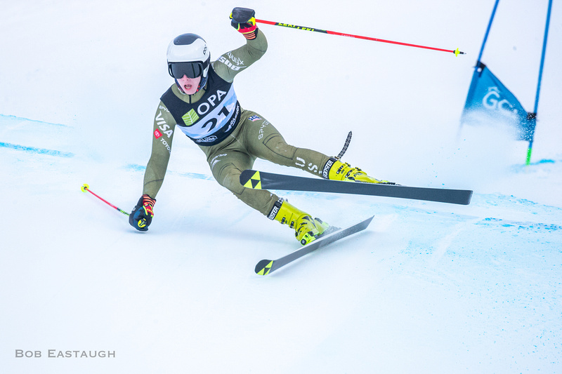


He squeezed past.
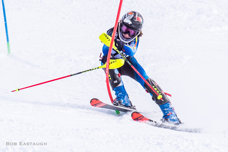

Interesting graphics: two slalom poles arc in unison following impact.


Visible emotion (here, pleasure) can be a factor.


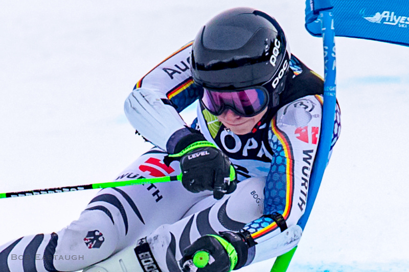
Likewise, visible eyes add to the immediacy of a photo. But that raises this question: which is better, showing the racer's entire body (in part to depict the technical quality of his skiing and the idealized simultaneous contacts of his left pole guard and his right boot-top with the slalom pole), or cropping tightly on his face and eyes?


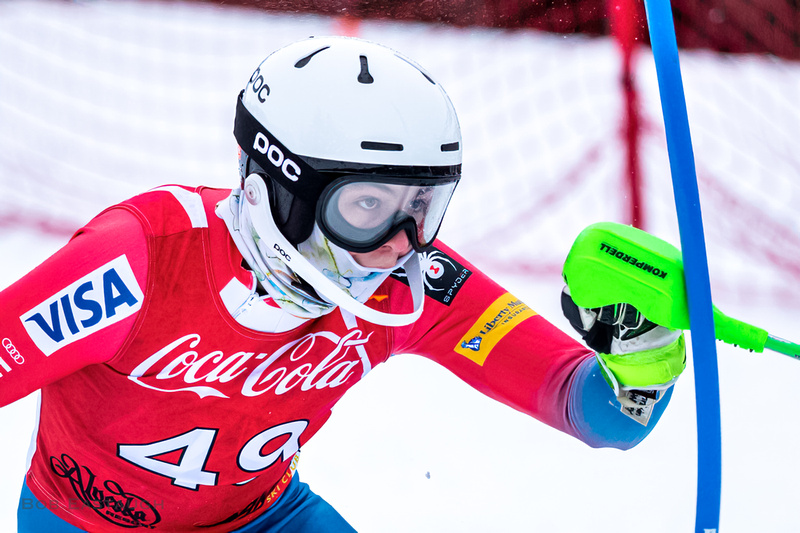

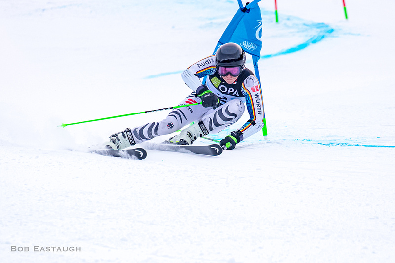
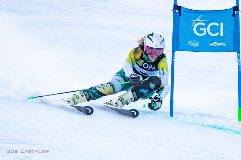
Approach angle matters. Probably most people would rather see the racer's approach and face. Even though the U14 racer makes a fine Super-G turn and nicely clears the panel with his forearm, the U19 racer dynamically brushes past her GS gate, and most viewers would prefer her photos for positional reasons. The last image is her first photo, tightly cropped. It shows her face well, despite the tinted goggle lenses. Is the GS panel a distraction? Maybe, but it also predicts imminent impact, i.e., drama.


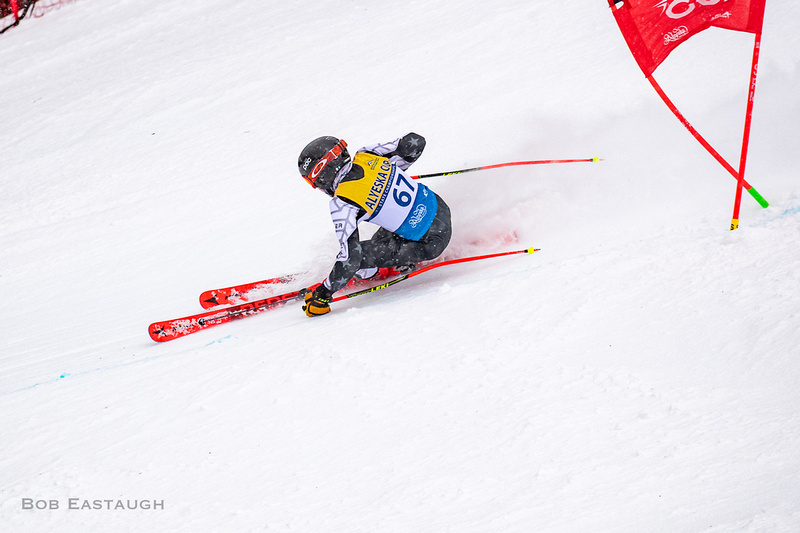


Seemingly minor details can make a difference, especially to racers. This series shows differences in the camber (bend) of the outside ski and angle of the raised inside ski. And I also cropped the last photo to show more of the course, illustrating the racer's approaching arcs to give some context. Which is better?
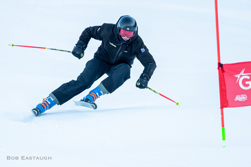

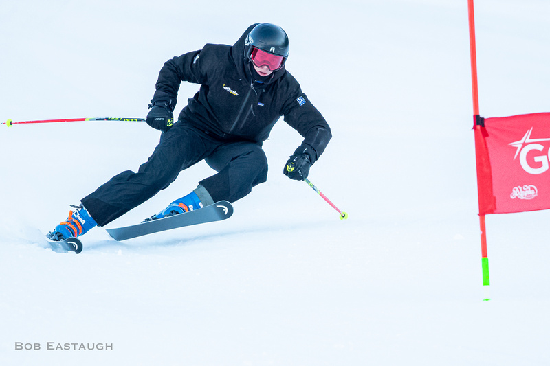


Assuming high-quality images (focused and exposed correctly), which is the best choice of these two series? The first is of Alyeska Ski Club U16 Porter Langlie in a GS (and it is a particular pleasure to show him skiing up to his skill-level, given occasional mishaps, also sometimes depicted here). Porter is framed by the gate in the first shot, and that is visually nice, but the third shows heavy impact, the third shows how he brushes past the gate, and the fifth shows the aftermath, as the gate deflects. The last is a tight crop of the third, to emphasize his eyes and the moment of impact.
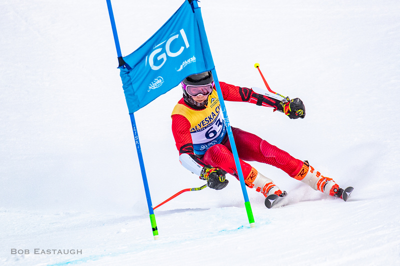


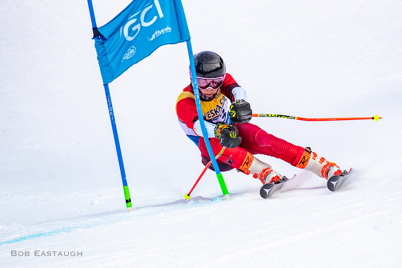


The second is of Lie Djurestaal, a graduating UAA racer from Sweden, skiing past a GS gate in a FIS race. She is making a very clean, efficient turn and her line (a tactical choice) takes her past the gate with almost no contact. The third image is a looser crop of the fourth, to show context. The last is a tight crop of the fourth, to concentrate on her concentration and determination. The middle three (four, five, and six) show her immediately approaching and passing the panel. It is hard to choose among them. The panel might seem to be a visual obstacle in the first two (four and five), but even though she has passed that "obstacle" in the fifth, her turn now seems slightly less dynamic, her skis are slightly depressured. Of those three, I like the the fourth best because is shows how low her hips are, perhaps only four or five inches off the snow. Lie makes this deceptively powerful turn seem effortless. I also like the very las (a crop of the fourth), because I like tighter crops, and it still shows how low her hips are. But some might prefer to see the skis working.



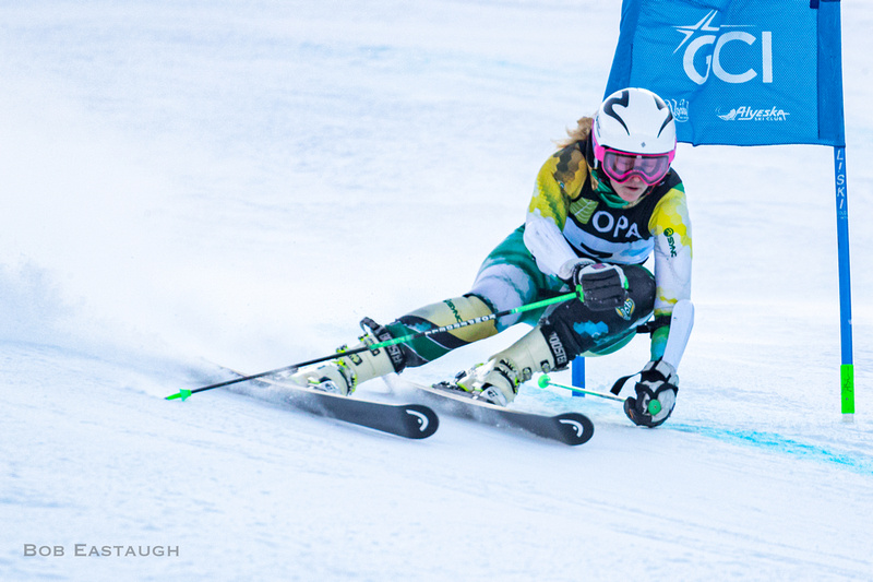


This series of U19 Colin Horrigan presents similar choices, pre- to post-contact.


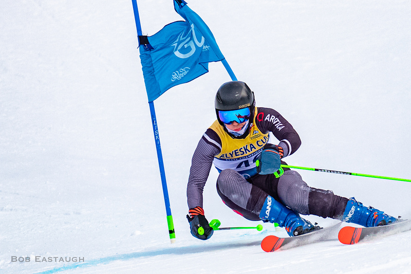


Finally, consider these images of Hunter Eid, coming off the last pitch in the final gates of a FIS GS. The first four images show him approaching, hitting, and leaving the gate. The next four are tighter crops of the first four, to show his face and concentration and how he is looking ahead.
"Crush" shots (like the second) can be predictable. For technical reasons, the first is nice because it shows a very skilled entry into the turn. I like the fourth best, because the gate is still heavily deflected, and Hunter is already beginning to make the transition to the next gate.
The last three simply show his speed as he passes a gate just before the finish. The best of those last three is, I think, the second, because he is past the gate and still in a dynamic position, but a good argument could be made for the first, where his skis are more fully loaded and are carving cleanly.


